StayLinked SmartTiles offer customized on-screen buttons for various tasks that are independent of the emulation screen. These tiles can be globally set based on standard client settings or customized to provide the desired on-screen buttons to work with the context presented to the users.
SmartTiles are primarily used to create custom keyboards. They allow you to place buttons as simple as single characters or more complex macros. They can be used for navigation, screen placement and other features, much like the options available in SmartTE.
Organized into ‘collections’ each set of tiles can include any desired buttons organized into pages. This allows you to use centralized configuration tools to create a custom interface for different device types and screen sizes.
By example, you might create three collections, one for a ‘landscape orientation’ wrist wearable, another for a ‘portrait’ style handheld computer and a third for a full screen vehicle mount or desktop computer. Each of these collections might have multiple pages, allowing the user to cycle between different types of tiles.
These collections are then served to the devices configured to use them. Clients must be at least version 14.4 or newer to take advantage of these features.
SmartTiles Collections are configured in the Emulation Settings section of the Administrator. You can right click in the blank area of the SmartTiles Collections window for a list of options:
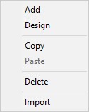
Add: Create a new collection from scratch.
Design: Make adjustments to the selected collection
Copy: Copies the selected collection to the Administrator Clipboard.
Paste: Use a copied collection create a new collection.
Delete: Remove the selected collection.
Import: Create a new collection that is a copy of an exported collection. This allows you to import collections from outside sources or use a template. Your installation may include various samples and templates. Additional templates may become available for import from the StayLinked downloads site.
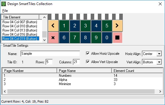
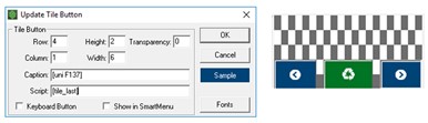
Unused areas of a collection will become transparent, showing the emulation screen contents. You can see these areas in the image below as the grey and white checkered area. Buttons created in this area share the SmartTE button design options. The configuration panels include the options listed below. Each page in a collection will be the same dimensions, with the selected page showing in the design area at the top of the screen.
The top File menu has the following options.
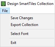
Save Changes: Saving your collection will cause changes to take effect as the user navigates or refreshes pages within any existing sessions that are using that collection.
Export Collection: Writes the selected collection out to an XML file that can be imported on any v14.4 or newer StayLinked server.
Select Font: This option allows you to change the font size and aspect ratio of the designer. Changing fonts will shape the designer to the height and width of the font selected, but will not change the display font. Changing the font size will resize the design area to be larger or smaller making it easier to work with the space on your PC.
Note that collection pages will not be presented to devices with a viewport using a smaller row and column size than the assigned SmartTiles Collection. You can confirm the viewport dimensions of any session by double clicking the session in the Administrator’s connections list, or with a right click > Details.
The Tile Elements list box will show each button that has been added to the selected page. You can click on the buttons or on the elements in the list for any commands that affect that button.
The following options are available in each collection:
Name: The description or title for each SmartTiles collection is for general information.
Allow Horiz Upscale: This option allows the collection to fit into a device screen that is wider than the collection size.
Horiz Align: Used when the SmartTiles collection is not as wide as the device screen, this allows you to set collections to the left, center, or right edge of the device screen without having to exactly match the width of the device screen as long as the collection is smaller than the device screen.
Tile ID: This value is automatically assigned a key number used when configuring devices to use SmartTiles. Tile collections are referenced using a Tile ID and a page number, separated by a comma. See the section below for more information about implementing collections on your client devices.
Rows: Sets the height of the tile collection.
Columns: Sets the width of the tile collection.
Allow Vert Upscale: This option allows the collection to fit into a device screen that is taller than the collection size.
Vert Align: Used when the SmartTile collection assigned to a device is not as tall as the device screen, this allows you to set collections to the center, top, or bottom of the device screen without having to exactly match the height on the device screen as long as the collection is smaller than the device screen.
The following items are displayed in the list box columns at the bottom of the panel. Adding additional pages can be done by right clicking in this list box.
Page Number: This is the number of each page in the collection. The page numbers are automatically assigned. You can change the page number and order by dragging or moving pages up or down in the list box. Context menu options include Move Up and Move Down when alternate clicking on an individual page in the list box.
Page Name: The descriptive name of each page in the collection.
Element Count: The number of buttons on each page of the collection.
You can add new buttons once you’ve created a new collection and page.
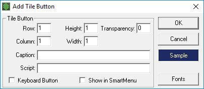
The button dialogue includes the following configuration options:
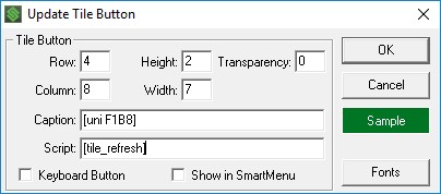
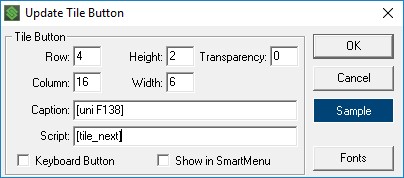
Row and Column: Set the position on the tiles area based on the upper-left corner of the button.
Height and Width: Set the size of the button. Buttons can span multiple rows and columns, and will stretch to fit the area.
Transparency: Set the alpha level of the button from 0 (opaque) to 100 (transparent). Higher numbers are more transparent allowing the emulation space behind the button to show through. Note that the Administrator Tile Designer will not show transparency and transparency should be tested on a device screen for best results.
Starting in v15.1 build 208, clients can be configured (smarttile_caption = 0 or 1 ) to ignore transparency settings for the caption on buttons that are at least partially transparent. This is available as a client setting and applied to all SmartTile buttons with transparency. Both the client and server versions are required for the support of this feature.
Caption: Enter the label to be displayed on the button to describe the action the button provides. Releases after May 4th, 2022 (Administrator build 214, Android client build 228 and iOS client build 144(5) newer) add the option for using a [newline] mnemonic to split captions over multiple lines.
Script: The action script to be executed when the button is used.
Keyboard Button: Select this checkbox to use the pressed transparency setting for on-screen keyboards. This changes the transparency while the button is depressed to the value set for the Client Setting configured under Scanner and Keyboard > Smart Keyboard Fade While Pressed.
Show in SmartMenu: Select this checkbox to include this button on a SmartMenu. SmartMenu uses an OS dialogue list box to present all on-screen buttons and SmartTiles with this option selected.
Fonts: Use this button if the Tile button caption should be displayed using a font other than the device default. This also applies to the Administrator design tool, which defaults to the Roboto font for standard button display. See the section below about FontAwesome for more information. Buttons have the following display settings, accessed by clicking the ‘sample’ button in the right edge of the panel.
Buttons have the following display settings, accessed by clicking the ‘sample’ button in the right edge of the panel.
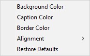
Background Color: Sets the background color using the RGB color picker or select ‘use last’ to repeat the previous color.
Caption Color: Sets the text color using the RGB color picker.
Border Color: Sets the button border color using the RGB color picker. Client settings can be used to change the size of the button border if desired.
Alignment: Set the caption to left, center or right aligned on the button area.
Restore Defaults: Sets the button properties back to the default values.
Right clicking on in the design area provides the following options:
Edit: Allows you to adjust the options within that button configuration.
Delete: Remove the selected button.
Copy Button: Make a copy of a button, allowing you to paste in into a blank area of the designer.
Paste Button: Place a copied button into the selected area.
Copy Attributes: Copy the colors and caption alignment of a button.
Paste Attributes: Apply the colors and caption alignment from the copy attributes of a button.
Switching Between Tile Pages
SmartTiles are organized into pages to keep pertinent content on the display and avoid showing users options they might not need. SmartTiles collections used for customized keyboards are commonly organized by pages of function keys, scripts, numeric, and alphabetical buttons. Most handheld devices would not be able to clearly show any screen contents if all of these buttons were included on the same tile.
The following mnemonics can be used in buttons or keyboard map entries to step through the various tiles in a collection:
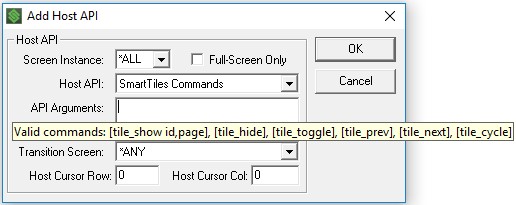
[tile_show #,#] This will take the user directly to a tile collection ID and page, as entered in the number options. For example, [tile_show 4,3] would display page three of tile collection four. [tile_show ,3] would display page three of the current collection. [tile_show] would show the current page in the current collection.
[tile_hide] This removes the current tile from the screen, allowing the user to see the emulation space. Once hidden, the user would need to select an extended keys or keyboard map entry to show a new collection and page.
[tile_toggle] This is a combination of the hide and show mnemonics which will hide the tile if it is currently displayed, or show it if it was currently hidden.
[tile_prev] Displays the previous page in the current SmartTile collection. Using this mnemonic on the first page will wrap back to the last page of the current collection.
[tile_next] Displays the next page in the current SmartTile collection. Using this mnemonic on the last page will wrap back to the first page of the current collection.
[tile_cycle] This mnemonic works much like the next option, except that it includes a blank or hide option after the last page of the collection.
[tile_refresh] Used primarily during initial testing and design, this mnemonic will request the latest copy of the collection page from the StayLinked server. This allows you to immediately see any changes on the collection page on your device without having to change pages or reconnect.
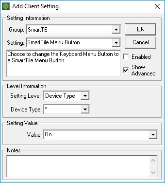
In addition to these mnemonics, there is also a client setting that can replace the typical Keyboard button on SmartTE devices with a SmartTiles button. This button acts like the [tile_toggle] mnemonic above, but also replaces the standed two finger tap gesture. Without this setting, a two-finger tap would hide or display the Smart Keyboard, but this setting will change the gesture to perform a [tile_toggle] on the current SmartTiles page.
Implementing SmartTiles Collections
Once your collection is created, you can enable it on devices using several methods.
The mnemonics listed above will not work until a collection has been assigned to the device. You can assign an initial collection by setting a default collection client setting, or using a Screen Recognition Host API for the ‘SmartTiles Commands’ with the [tile_show #,#] mnemonic. Note that using a collection ID with a page of 0 will assign the current collection but will not display a page. Once the collection is assigned, you can use the mnmeonics above to navigate the various collections and pages. Note that using these features to change collections will set the new current collection, causing the mnemonics above to cycle through that collection until a new collection is selected.
Client settings will be the best choice for a fixed set of pages on a particular model or type of device. The client setting can set the default collection and page for the client to start with. In the example below, the device would be assigned to collection number one but no page would be displayed until additional SmartTile mnemonic commands are issued by the user or StayLinked server.
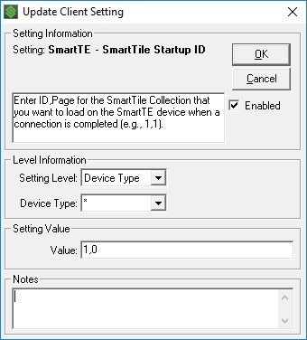
Note: Make sure your clients support this feature before sending the client setting. Clients that are not at least v14.4 will not write the setting and will not try to implement the setting unless the setting date is adjusted on the StayLinked Server. Clients should show the default collection number and page in the ini file when successfully implemented. Based on the example above, the entry in the client configuration would read:
smarttile_startup_id = 1,0
For a more intuitive implementation, StayLinked Screen Recognition features can be used to display a collection and page. This is accomplished using the Host APIs section of screen recognition. This might be used to show the tile page that best supplies valid options to your users. For example, moving to a screen that prompts for the entry of quantities might take the user to a tile with numeric buttons and common quantitiy amounts.
SmartTiles and FontAwesome
Similar to the implementation of SmartTE, SmartTiles can take advantage of the icons in FontAwesome. By changing the font to FontAwesome, buttons can access the [uni XXXX] range of characters in the FontAwesome library. A comprehensive list of these icons can be found online by searching for FontAwesome Cheatsheet. These three icons for example:
SmartTiles Performance
Starting with StayLinked Server version 15.3 build 214 when used with an Android Client v15.3 build 230, SmartTiles support caching options. This allows the clients to locally store data that would previously been updated with each server update. This implementation improves the user experience by reducing communication updates between the client and server.
Caching is automatic when current server and client versions are used. Caching can be disabled using the Client Settings feature through the StayLinked Administrator, allowing specific clients to be configured as desired. If you're making changes to SmartTiles and not seeing them reflected in new sessions, you'll want to disable this caching using the Client Setting until your changes have been distributed. Once the changes are pushed to affected devices, we recommend you re-enable caching for improved performance.
The new mnemonic [tile_refresh #,#] can be used to re-acquire the collection from the server. This allows dynamic content to update variables that may be used for button labels or contents.
Share the post "Administrator User Guide – Managing SmartTiles Collections"