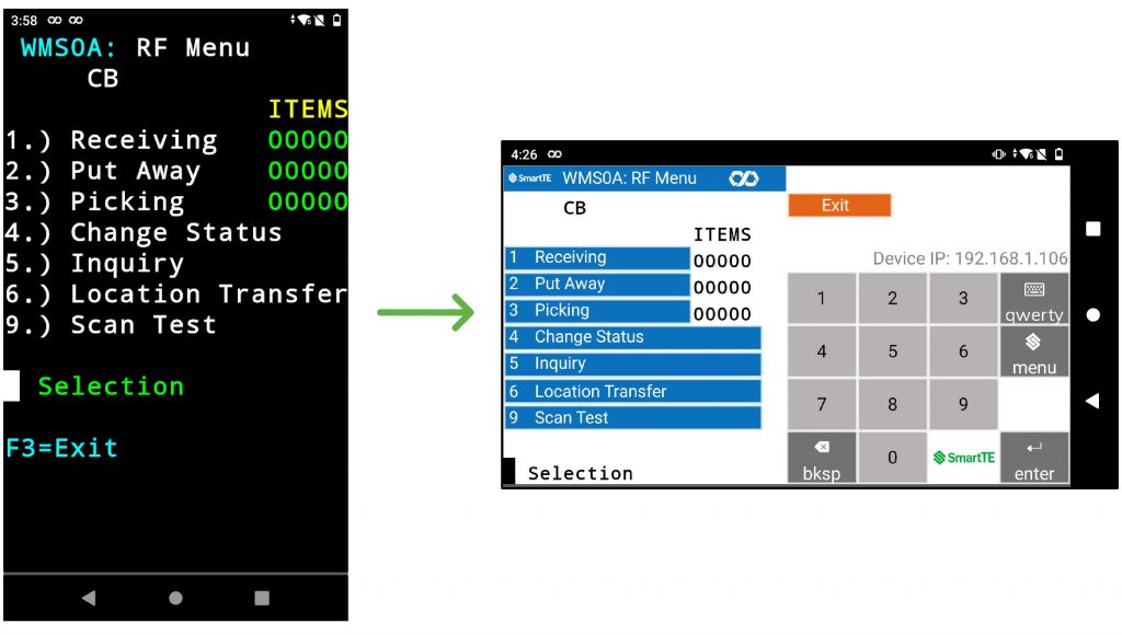
Most warehouse management systems are designed for screens in portrait orientation. Introducing new wearables that operate in landscape orientation presents a significant challenge in that portrait screens are basically unusable in a landscape format without significant alteration. Most portrait screens show data on the top half with keyboard entry on the bottom half. This feature enables rapid conversion of existing Portrait screens to Landscape format; automatically splitting the existing portrait screens into two halves: data and keyboard side by side (see 'Before' and 'After' screens below).
Advantages
- Rapidly produce a working demonstration of the existing Portrait application utilizing the Dynamic features of SmartTE (tap spots, smart tiles).
- Overcome apprehension around assigning or hiring highly skilled programmers to modify their applications for use in a landscape format. SmartTE requires no coding or scripting.
- Significantly lower cost and time to roll out new landscape wearables. Many weeks of software effort can be reduced to a day’s work using the Dynamic features of SmartTE.
- Create future opportunities with the potential to roll out SmartTE on other devices.
- Speed up the project by decreasing the development time required to pilot and roll out new wearables.
Step 1: Client Settings
In this exercise, we will explain in detail the steps taken with SmartTE to achieve the conversion from a keyboard-driven portrait green screen application to an all-touch modernized landscape application; covering a few of the features of SmartTE and how they can be used.
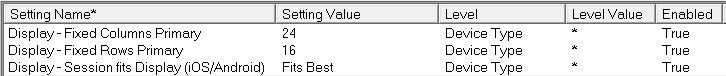
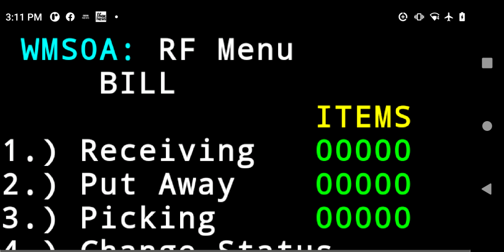
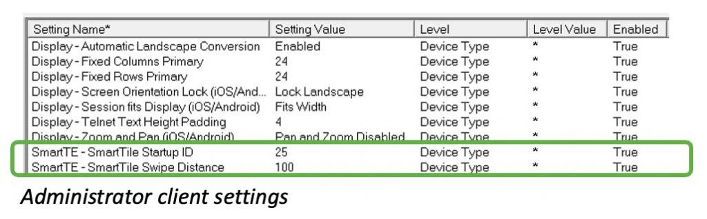
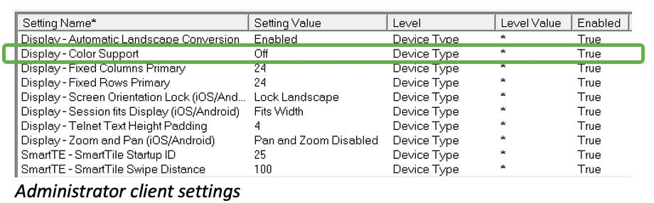
First, let’s start with the StayLinked Demo Host Application in a very basic portrait setup. In the Administrator in “Client Settings”, ensure the three “Display” settings match the table below. If the setting is not shown in your list, search and add it when necessary. Ensure to set the appropriate device type to what you are using and enable the setting. We are using “*” as our device type, which should work for any mobile device.
Your screen should look something like this, but results will vary depending on the mobile device used.
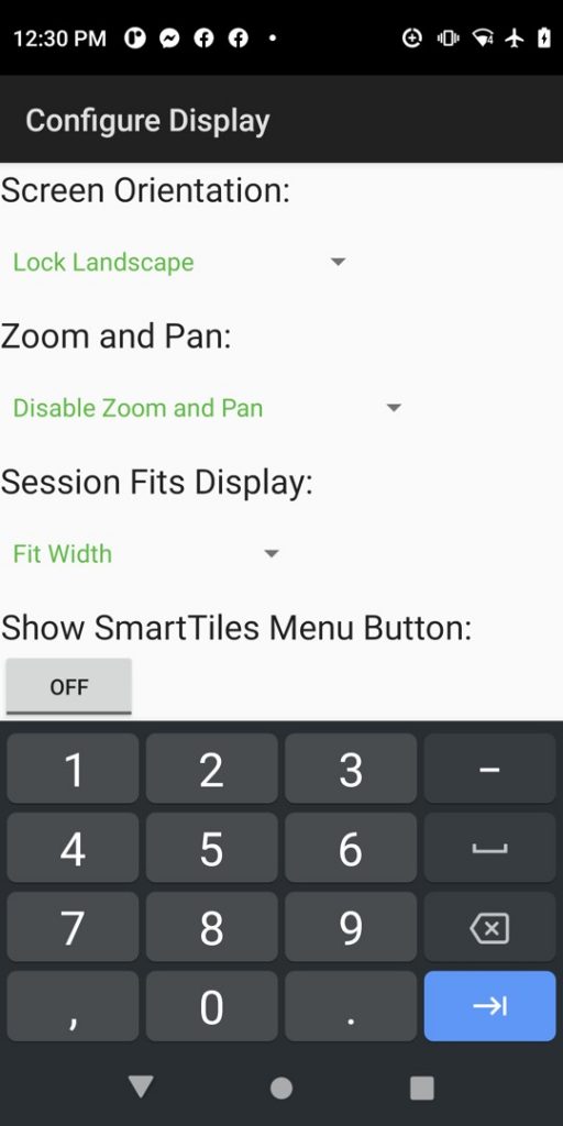
In the StayLinked client on the mobile device, set the following:
- Lock Landscape
- Disable Zoom and Pan (we will eventually add a SmartTile keyboard)
- Fit Width (usually works best for landscape applications)
Step 2: Screen Optimization
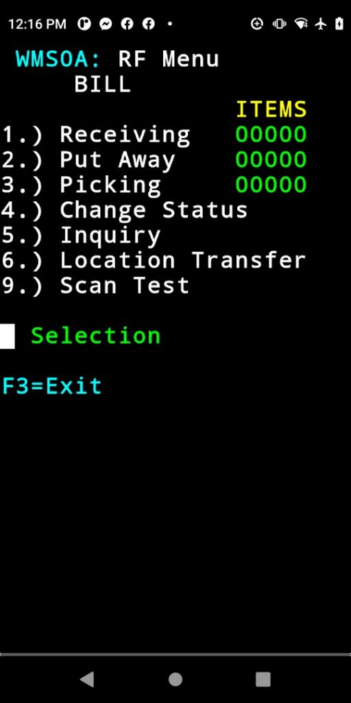
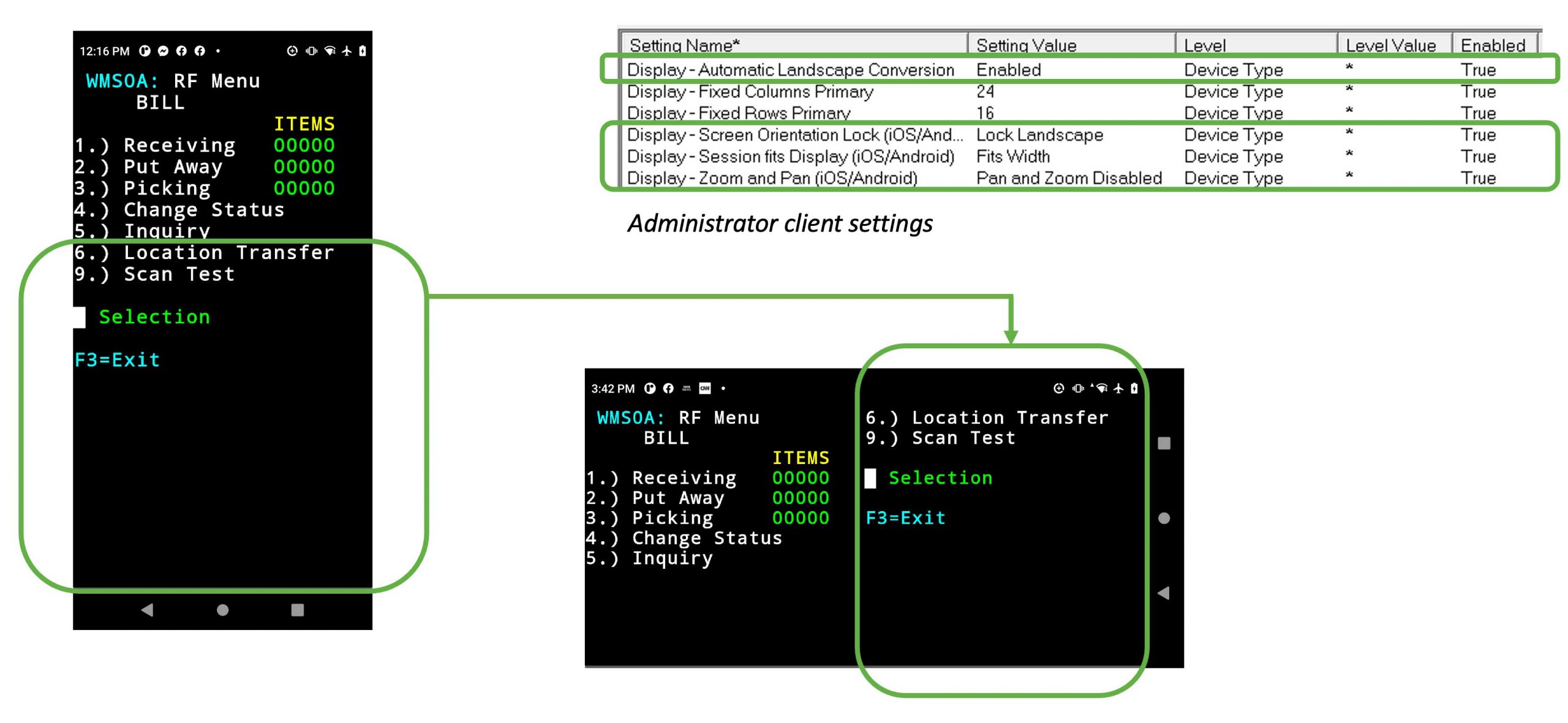
In landscape mode, our screen covers the entire display using the “Fit Width” setting, but only a few rows are displayed as shown below.
In the Administrator in “Client Settings”, make the following changes. If the setting is not shown in your list, right click in the open area and search and add the setting into the list. Ensure to set the appropriate device type to what you are using and enable the setting. We have used “*” in this example to cover any device type.
The following three Client Settings simply repeat the ones we just performed on the StayLinked client on the mobile device; so that the settings will persist after the mobile device resets, cold boots, or if you are going to add any additional mobile devices that these new settings need to flow to from the StayLinked Server.
- “Display / Screen Orientation Lock” – set to landscape to match the SmartTE client setting on the mobile device
- “Display – Session Fits Display (iOS / Android)” – change from “Fits Best” to “Fits Width” to match the SmartTE client setting on the mobile device
- “Display – Zoom and Pan (iOS / Android)” – set to “Pan and Zoom disabled” to match the SmartTE client setting on the mobile device
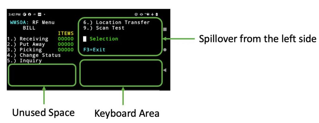
“Display – Automatic Landscape Conversion” – Enable “Automatic Landscape” in the Administrator’s “Client Settings” to split the screen into two equal halves. Text on the bottom portion of the original portrait screen will spill over on the right side of the landscape display, flowing from top to bottom. Now save changes and terminate your session from the Administrator in “All Connections” and reconnect from the mobile device to view the changes.
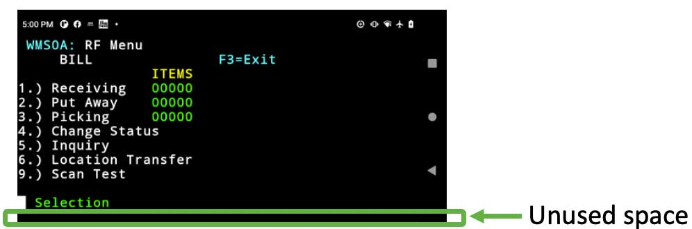
On our current screen, we can see unused space on the bottom of the display. Portions of the menu shown now at the top right look like they could fit at the bottom left. Our goal is to fit the screen information mainly on the left side, reserving space for frequently used instructions like “F3=Exit” or error messages on the top right. This leaves us room for the addition of a keyboard on the bottom right.
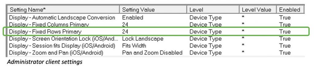
Step 3: Row and Column Adjustments
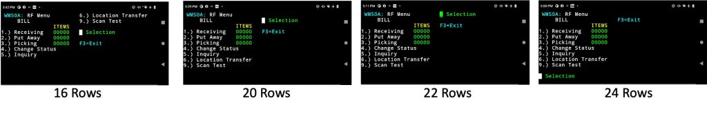
Increasing the number of rows will allow more information to be shown vertically on both sides of the display. In this case in the Administrator in “Client Settings”, we gradually increase the rows until we achieve the desired result at 24 rows. As the number of rows is increased, more information fits on the left and less information spills over onto the top right. It is necessary to terminate your session in the Administrator in “All Connections” and reconnect from the mobile device to view each change. The progression of the screens below illustrates the behavior of this setting.
We are making progress, but we can see a bit of unused space on the bottom of the display. We want to make the text as large as possible to read and press, considering we are enabling these as tap spots later.
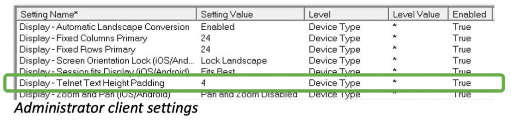
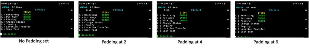
In the Administrator in “Client Settings”, add “Display – Telnet Text Height Padding”. Set this value to add padding to the height of the telnet text. This pixel value will stretch the Telnet text to take full advantage of the available space. It is necessary to save changes and terminate your session from the Administrator in “All Connections” and reconnect from the mobile device to view each change. The screenshots below illustrate the behavior of this setting as we increase the value. Setting the padding value at “4” seems to hit the sweet spot for this mobile device.
SmartTip! The setting value required will vary across different mobile devices and display resolutions. If you see little or no change with single digit values, try double digit values or greater.
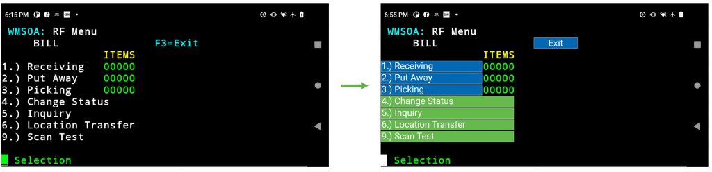
Step 4: Utilizing Tap Spots
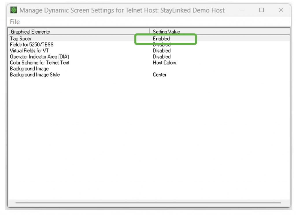
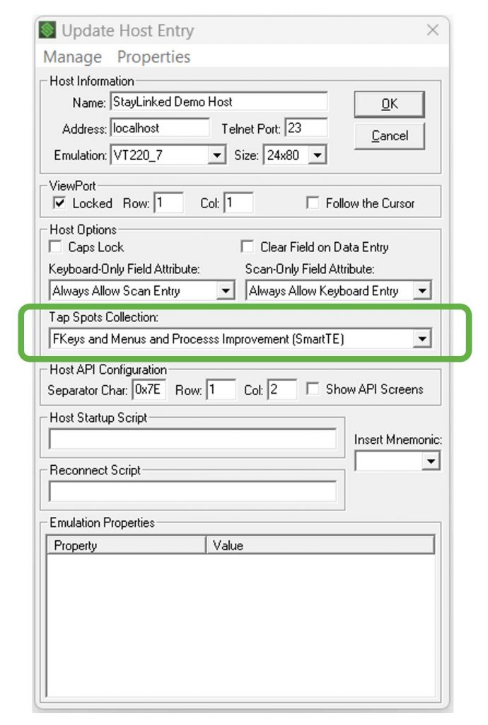
Enable Tap Spots to quickly touch-enable the application. For this example, we are using a Tap Spot Collection created for the StayLinked Demo application.
In the Administrator within your Host Group, enable tap spots in “Dynamic Screen Settings" and choose the tap spot collection of choice. If you do not have a tap spot collection already, you can create one in “Emulation Settings” – Tap Spot Collections”.
More information on tap spots can be found here.
Now terminate your session from the Administrator in “All Connections” and reconnect from the mobile device to see the changes.
Step 5: Implementing SmartTiles
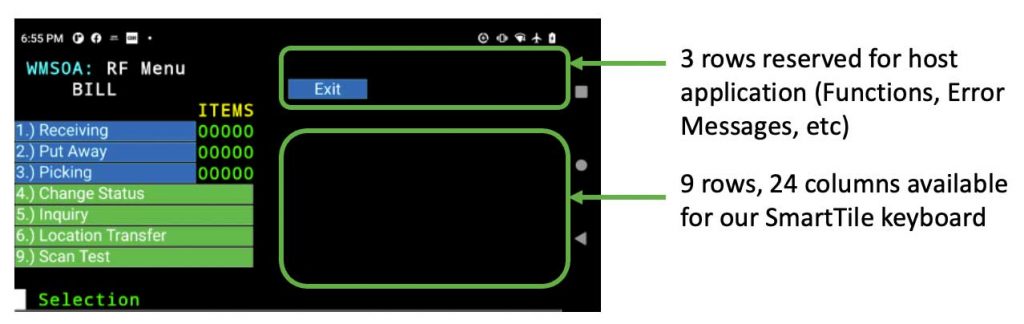
Now we are ready to add a keyboard in the bottom right corner. In this example, we have 3 rows at the top that we have reserved for the host application. This leaves us with 9 rows by 24 columns to create our keyboard using SmartTiles. For this example, we have created a smart tile collection that is 9 rows, 24 columns, and aligned to the bottom. More information on SmartTiles can be found here.
Once your SmartTile Collection is completed, in the Administrator in “Client Settings”, add “SmartTE – SmartTile Startup ID” and enter your SmartTile Collection.
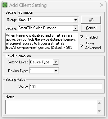
SmartTip! In default mode, it can be easy for an end user to unintentially swipe away the SmartTile. To eliminate this behavior, you can anchor your SmartTiles by going to Client Settings, and adding “SmartTile Swipe Distance” and set the value to '100' (as seen in the image below).
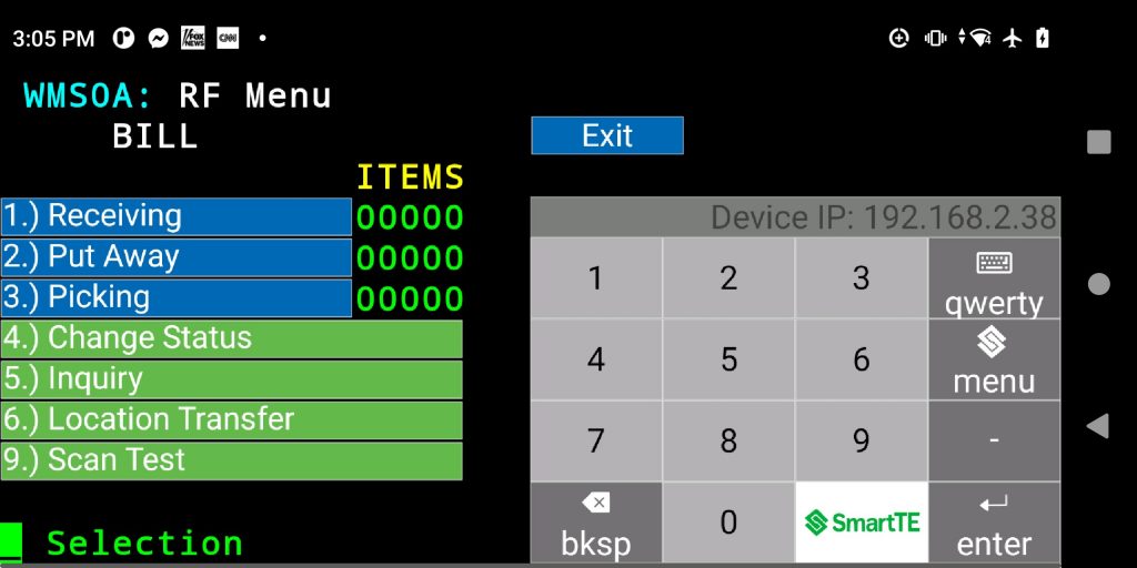
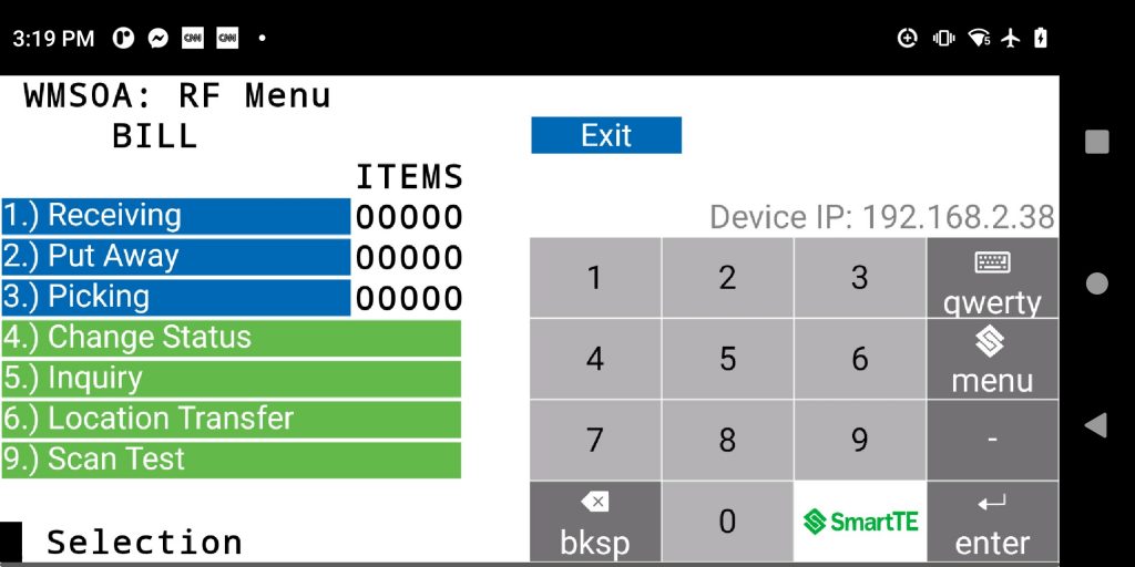
Now save changes and terminate your session from the Administrator in “All Connections” and reconnect from the mobile device to view the changes. It should look something like this.
Step 6: Color and Display Settings
To achieve a more modern user experience we can add a white background. There are many ways to accomplish this with SmartTE. For this exercise, we will demonstrate the simplest and fastest way.
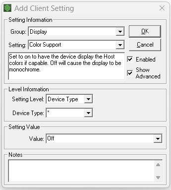
In the Administrator, in “Client Settings”, add “Display – Color Support” and set the Value to “Off”.
Now terminate your session from the Administrator in “All Connections” and reconnect from the mobile device to see the changes. You should see something like this:
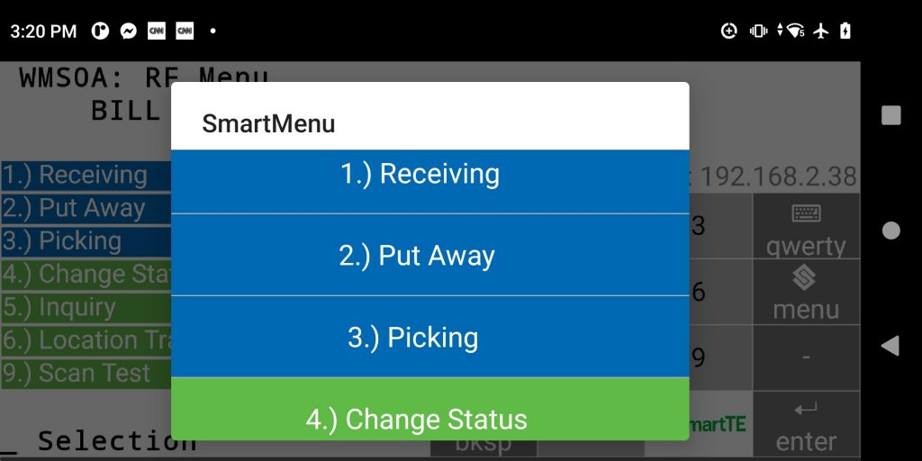
SmartTip! SmartMenu is another great tool for host applications with long menu’s and mobile devices with small touch screens (as seen in the image below).
Share the post "Using SmartLandscape"