When creating a reformatted screen, there are several different types of objects that can be placed on the client presentation screen. These objects can include:
Standard Emulation Objects
- Copy Block – A direct copy of the text contents in a specific place on the host screen to the reformatted screen. These contents will adhere to standard telnet rules and work both with TE and SmartTE clients. Copy blocks are typically created by highlighting the original area of the host screen.
- Constant – Static text in standard TE format that remains the same no matter what is presented on the host screen. This allows you to add text to the screen that didn’t already exist on the screen. As standard TE format, constants can be used with SmartTE and standard TE clients.
- Input Fields – These vary depending on the type of emulation. 5250 and 3270 emulation provides the ability to have multiple input locations on the same screen. Each of these input locations can be added to the reformatted screen, or left off if they are of no use to the device users.
When users advance through reformatted screens, the actual host cursor location can move to fields that are not presented to the user. Input modifiers and cursor locations can be important in to make sure users are not entering data into a field they cannot see or should not have access to.
Graphical SmartTE Objects (includes standard objects above, plus):
- Label – Graphical Labels are static text that did not need to exist on the original screen. These labels differ from a constant in that they are not limited to fixed-width display of standard emulation. These labels can also follow emulation color types or RGB values.
- Button – Buttons can help make input choices more obvious and help take advantage of the display area for input. StayLinked has included tap spots for years, but with SmartTE these tap spots become obvious input options to your users. Buttons are also automatically added to the SmartMenu list of available inputs. Buttons can be especially important to devices that no longer include a hardware keyboard and rely on on-screen keyboards that can take up emulation space.
- Image – From company logos and banners to product examples, images can help make an application look more modern or help reduce user questions. Images are downloaded to clients from an image library, which is a configurable path for both the Server and Administrator’s screen designer.
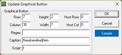
Starting with server release v16.1, the graphical label and button options now support the [newline] mnemonic to split text within the display of these elements. For example:

Copy Block
Copy Blocks allow you to select display elements from the original screen for placement on the new screen. Simply click and drag around the desired area and a new dialogue appears to gather the details of the display element. Copy blocks are based on the screen position. This makes them useful for text that can change, showing the current host contents in the new area.
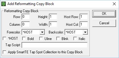
The copy block dialogue includes the following options:
Row and Column – Set the position on the reformatted screen based on the upper-left corner of the copy block.
Height and Width – Set the size of the copy block. Copy blocks can include multiple rows and columns, allowing large sections of the host screen to be copied to the reformatted screen.
Host Row and Host Column – Sets the location on the host screen of the copy block. This allows for easy adjustment if the original area was missed during selection.
Forecolor – Sets the text color, which can include standard telnet colors or continue with the colors presented by the host.
Backcolor – Sets the background color, which is typically a high-contrast color to the text color to allow for good visibility in any light conditions.
Attributes – These can include the attributes included by the host, or change the test to bold, underline, blinking and/or italic.
Tap Script – Allows the text block to perform a script when tapped or clicked by the user.
Apply SmartTE – This option will allow standard tap spot collections to apply to the copy block, turning any strings that qualify into SmartTE buttons as they would on a dynamic SmartTE screen.
Constants
Constants are static text that might not have been part of the original screen. They are added by right clicking in the preview area and selecting Add > Constant. Since constants are not pulled from the host screen, they do not offer the HOST options for formatting and attributes.
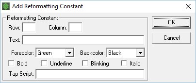
Other than the missing host components, these options behave the same as the options available in a copy block.
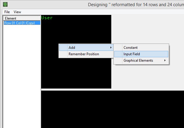
Input Fields
In 5250 and 3270, Right click on a field in the original screen map to add that input field to your reformatted screen. Fields are copied using a direct mapping, and cannot be broken into multiple fields or combined. Right clicking in the redesign screen will not prompt for Input Fields when reformatting 5250 emulation screens.
In VT emulation, representation of input locations is cosmetic and is identified by the cursor input position. StayLinked can represent these are multiple fields but it’s up to the host to accept the input location or use expected host commands to move between input locations.
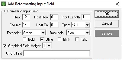
The options in this dialogue are much like the others in which you can set display options and colors. Most important are the Host Row and Host Column settings, which work with the Input Length to determine the location inputs will be submitted to your telnet host.
Added in v15.0 build 208 and newer, two options allow you to specify field colors using the sample button in the same method as buttons, and the ghost text option, which pre-fills data similar to a watermark until replaced by the user. Server build 214 and newer no longer removes leading spaces in case you want to pad the placement for a more centered display.
Label
A graphical label is nearly the same as a constant. Constants and labels are both screen text with the exception that graphical labels are not limited to true-type fixed-width text and include a wide range of customization.
Setting a foreground and background color can use the standard emulation colors or take advantage of RGB colors using the RGB color option for foreground. Graphical labels are limited to standard background colors or a transparent background that will display the current background color or image for that area of the display.
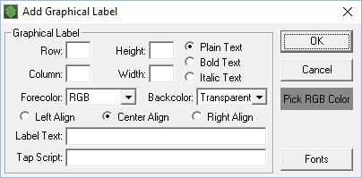
The label dialogue includes the following configuration options:
Row and Column – Set the position on the reformatted screen based on the upper-left corner of the label.
Height and Width – Set the size of the label. Labels can include multiple rows and columns, and will stretch to fit the label area allowing for large text format.
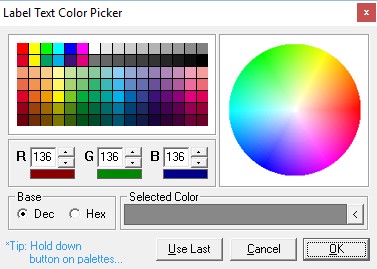
Forecolor – Sets the text color, which can include standard telnet colors or RGB for custom colors using RGB color values. Setting RGB will display the Pick RGB color box under the cancel key.
Backcolor – Sets the background color to a standard telnet color or transparent to maintain the original color or background image for that area of the screen.
Alignment – Set the label contents to left, center or right aligned.
Attributes – These can include the standard text or use the bold and italic attributes.
Label Text – This includes the text to fit in the label area. Please note that variables can be used to capture screen contents and turn them into a label format. Variables are entered by typing the variable name with percent symbols at the beginning and end. Note that Server v15.4 and newer releases preserve leading and trailing spaces to allow for custom positioning. Prior releases would automatically trim spaces at the beginning and end of any label string.
Tap Script – Allows the label to perform a script when tapped or clicked by the user.
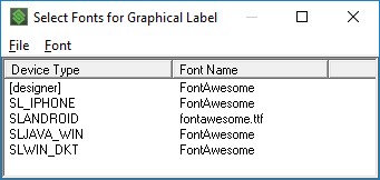
Fonts – Set custom fonts based on device type.
Clients can display standard emulation screens in any true-type fixed-width font, but graphical labels can display any font on the device. The font will default to the client font, unless configured with a replacement for each device type. Using a wildcard of * will help limit the number of entries required for different device types. In the example below, only the Broadway font would be used on this label, since it applies to all Smart TE devices. Devices that do not have this font available will revert to the default font.
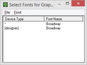
In order for the designer to show custom fonts, you must add a device type [designer] with the desired value. Without this tag, the designer will continue to display the standard fonts. Fonts selected for display must also be available on the devices that will display these screens, so font files may need to be distributed to devices if the font is specific to your configuration.
Button
Buttons are actionable objects, displayed with configurable background, text and border colors. Creating buttons on a reformatted screen can be a critical part of reducing user input errors. Buttons can be created to allow for larger area or gaps to reduce the occurrence of invalid entries.
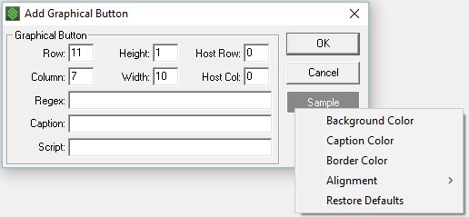
Right clicking the sample button will provide menu options.
The button dialogue includes the following configuration options:
Row and Column – Set the position on the reformatted screen based on the upper-left corner of the button.
Height and Width – Set the size of the button. Buttons can include multiple rows and columns, and will stretch to fit the area.
Regex – Included out of order because the regular expression depends on host screen contents. If a regular expression is included in this dialogue, the regex is applied to the screen position to determine if the button should be presented.
Host Row and Host Column – Sets the location of the regular expression processing on the host screen.
Caption – Enter the label to be displayed on the button to describe the action the button provides.
Script – The action script to be executed when the button is used.
Button display Settings
Background Color – Sets the background color using the RGB color picker, or select ‘use last’ to repeat the previous color.
Caption Color – Sets the text color using the RGB color picker.
Border Color – Sets the button border color using the RGB color picker. Client settings can be used to change the size of the button border if desired.
Alignment – Set the caption to left, center or right aligned on the button area.
Restore Defaults – Sets the button properties back to the default values.
The Regex and Host Row/Column positions allow for contextual display of buttons. If the conditions of the regular expression are met at the host position, then the button will be displayed. This allows you to show or hide a button based on the screen contents. Buttons cannot overlap, but you may have multiple buttons that display or hide based on the contents of the same host display location. It’s important to note that the host position are based on the original screen contents, not the screen being displayed to the client.
Conditional buttons that do not meet the regular expression criteria will not be displayed on the device and will show as a white box with a red X in the designed. This same box displays for images that could not be found by the designer.
Images
There are many different reasons for the use of image files. These range from product examples, company logos, or screen backgrounds. Dynamic reformatting supports the use of a single image as a background, with a control for opacity to fade the image as a watermark. In screen reformatting, images can be used to greatly change the style of the screens presented to the device users. Using images can result in an application that no longer looks remotely like telnet, and could look more like a smartphone application.
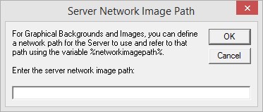
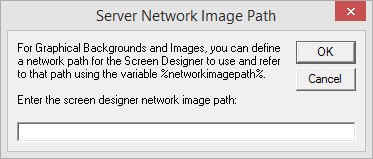
Adding images to a reformatted screen requires the image to exist in two places. The StayLinked Administrator has an images directory for use by the designer. The StayLinked Server distributes images from the images folder of the StayLinked Server. Creating a shared library for images can be accomplished by setting the same image path to a network location accessible by the Server, Administrator and Client devices.
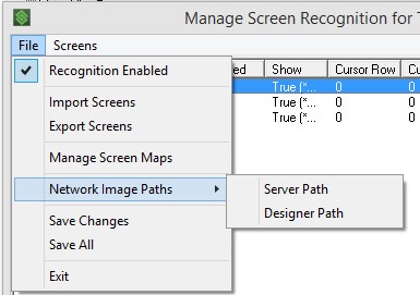
Image file locations are configured in the Manage Screen Recognition main screen must be manually copied to the Server or URL source directory. Images that are not available to the Administrator will display a red X image with white background in the preview indicating that the Administrator cannot display the image. If an image path is set, you can enter the %networkimagepath% variable with any image file name to properly reference the file.
Hosting Images with StayLinked iQ
With the addition of StayLinked iQ, the StayLinked Server includes the ability to host an HTML page. This HTTP source location makes an excellent image library location. This option may be disabled, requiring that the StayLinked iQ Tech Preview feature is enabled for the folder to be available.
The IP address of the server would be part of the address entered into the screen recognition dialogue. For example, if your StayLinked server was IP 192.168.100.25 hosting back.jpg the URL would be:
http://192.168.100.25:3006/back.jpg
The file would be placed on the StayLinked server in the iQ folder:
C:\Program Files\Stay-Linked\iq\back.jpg
Image files cannot be hosted from an HTTPS source.
Adding images to your reformatted screen can be done by right clicking in the reformatted screen.
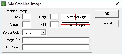
The image dialogue includes the following configuration options:
Row and Column – Set the position on the reformatted screen based on the upper-left corner of the image.
Height and Width – Set the size of the image. Images can include multiple rows and columns, presenting differently based on the fit options that are selected. Images will maintain their original aspect radio and will display differently on devices with different screen resolutions.
Horizontal Alignment – Click to set the horizontal positioning to left, right, center or stretch. The red line will show the position selected as a straight line, or bar with blocks at each end for stretch.
Vertical Alignment – Click to set the vertical positioning to top, bottom, center or stretch. The red line will show the position selected as a straight line, or bar with blocks at each end for stretch.
Border Color – Select the image border color to include a thin border around the image. Color options are limited to standard telnet colors.
Image File – Enter the name and path of the image file. This value must be available from each source or the file will not be able to be displayed in all instances.
Tap Script – Allows the text block to perform a script when tapped or clicked by the user.
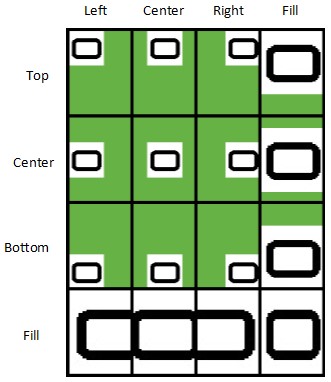
This image to the left provides an example of the various combinations of alignment at stretch-to-fit.
Vertical alignments are listed along the left and the horizontal options run from left to right.
Each box contains the same small rounded rectangle image, aligned or stretched to occupy a black box as it might appear in the screen design tool.

Image actual Size
As you can see, maintaining the original aspect ratio of an image can be important to maintain the shape and style of that image. Edges of your image may be lost if the aspect ratio is configured to fit one dimension but not the other.
Unicode and FontAwesome
StayLinked SmartTE labels and buttons support the use of Unicode range glyphs within FontAwesome. This can help reduce the overhead of graphical elements by using them from a font file. When using the Unicode values, the font file with the desired glyphs must be included on remote devices. The StayLinked Administrator automatically supports FontAwesome, turning any private use range Unicode values directly into the FontAwesome glyph.
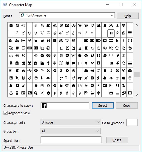
A list of available glyphs is best viewed using the Windows Character Map. This can be run by selecting typing charmap into the Windows start menu, open the character map program and then selecting the desired font. This displays a list of glyphs that appear in the font, and you can see the ASCII/Unicode value for each glyph from the tooltip or at the bottom of the window in the status bar after selecting a character. The current StayLinked Administrator installation package will automatically install the FontAwesome font.
Using FontAwesome in Graphical Labels:
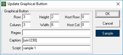
Enter the Unicode value by using the uni mnemonic. For example, the Facebook icon in the image above is F230. You can use this is StayLinked by entering [uni F230] in your graphical label. When using a graphical label, each device type must specify the desired font and that font must exist on the device. Note that you can use a wildcard to cover multiple device types.
This means that different device types can use different fonts to display the same label. If the font on the device does not contain a character, the device will revert to the default substitution font.
Be sure to copy existing labels if you want to copy the font selection, this prevents having to enter these values in each label.
Using Unicode Characters or FontAwesome in Graphical Buttons:
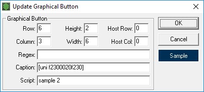
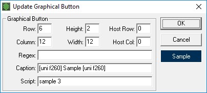
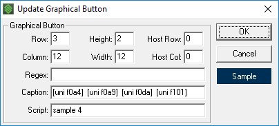
As with graphical labels above, buttons can use the [uni ####] mnemonic to specify the Unicode value for the desired Unicode glyphs in graphical buttons. The graphical button will detect Unicode values in the FontAwesome private block range and automatically switch the font to FontAwesome. As wil the hex mnemonic and labels above, multiple characters can string together in a single mnemonic without needs to restart the mnemonic. For example, [uni F2300020F230] which is two Facebook logos with a space in between.
Here are some examples and the resulting buttons.


Share the post "Screen Reformatting Options"